Recently, the Houston Astros announced that
they will move to the American League next season, and to go with their new league, they would also get
new uniforms.
With that in mind, Paul Lukas, ESPN.com's writer for all things related to sports logos and uniforms,
announced on May 31 that
Uni-Watch (a sort of online community obsessed with sports logos and uniforms) would hold an Astros uniform design contest.
It's not an official contest; for all I know, the Astros' ownership and management may not consider any of the over 100 submissions that have come in for this contest. The point is, I had been waiting with baited breath for ages for such a contest, because all this time, I've had a design in mind that incorporates a number of elements from past uniforms, yet keeps in mind the spirit of astronauts--exploration, experimentation, "pushing the envelope," looking to the future.
The seed for the design was planted when the Astros unveiled their current unis over 10 years ago. I hated that design, but only because it looked better-suited for a team whose theme was "the Old West," not "astronauts."
You may recall that I've entered in a Uni-Watch contest before; my
Tigers road jersey concept ended up finishing 13th out of 94 entries in a 2010 contest.
Without further ado, I give you my design concept. Click on the picture below to see it in full size. Further down this blog entry is an explanation of various details in my concept.
Cap logo: I've liked the star with the two sides missing since it debuted in 1995, but the first two renditions (1995-99, 2000-present) missed the mark. The first one looked way too much like the logo
Lockheed Martin was using. The second, well, it didn't look too distinctive at all. And both were missing the all-important "H" for Houston that the 1965-1994 Astros had on their caps--such an omission would be fine if it was a team that was looking to move elsewhere, but the Astros, obviously, aren't. I wanted to bring that "H" back. I also wanted a star that was flying upwards like a rocket to match the "onward and upward" future-minded spirit of the space program. I hope that the upwards-shooting star doesn't remind anyone too strongly of
a certain series of NBC public service announcements. Heck, the far left side of that upwards-shooting star may even remind some of the left end of the airfoil you see in the classic (and current) NASA logo.
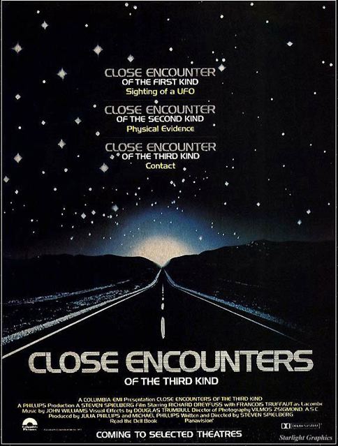
Wordmarks/numerals: The font is derived from a font you have already seen from
Close Encounters of the Third Kind (1977), Pepsi (late 1980s) and Star Trek: Deep Space Nine (1993-99). (That font definitely enhances the future-minded look I wanted to capture). I added some blocky serifs to it to give it a "Texas accent," and it may even remind you of the "HOUSTON" wordmark that the Astros once used on their road jerseys (1965-74). The wordmarks on the home and road jerseys swoop upwards--kind of like the Planet Hollywood logo or the logo the Seattle Sonics used in the 1990s--to match the upwards-shooting star and enhance that "onward and upward" spirit.
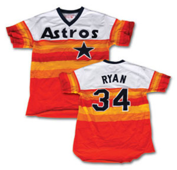
The proof is in the piping: You knew that the "tip of the cap" to the
"tequila sunrise" jerseys had to come in somewhere. I never considered using the 1975 "tequila sunrise" design as a base for my design; still, those orange-and-yellow stripes are a part of Astros' history and I wanted to incorporate them some way. So after much deliberation, I decided to give that tribute in the form of piping--namely, three-striped piping (similar to the blue-red-blue piping you see on the Atlanta Braves' jerseys) made from the Astros' new colors: Navy blue, bronze and gold.
But wait, Mark, did you say "bronze and gold"? I didn't want to use orange and yellow; not when their metallic equivalents are available here in the 21st century. Bronze and gold go so well with navy blue and they shine like the stars (OK, maybe that last part sounded corny). Besides, metals are tough and yellow is a color you often find on bruises. The upwards-shooting star is also bronze and gold to add to that aforementioned "tequila sunrise" tribute.
So there you have it. I'd love to see these unis become solid reality next year, but as I said, it's not an official contest. For all I know, the Astros may have already shelled out mucho dinero for some sports marketing firm to come out with turkeys like the ones they brought out 12 years ago. I wonder why sports franchises even bother. The Uni-Watch community is so much smarter and could provide a whole slate of design concepts.

