Monday, September 8, 2014

Volume 9, Number 4: Fun With Uniform Concepts, World Football League Style

Here we go again with another couple of uniform design concepts I made for a Uni-Watch contest.  On August 21, Phil Hecken, Uni-Watch's Vice Grand Poobah, announced a uniform design contest based on the following premise: If the World Football League never folded and was still operating today, what would their uniforms look like?  (The WFL was a professional football league founded in 1974 whose aim was to place American football on a global stage, but many of its teams encountered financial and/or attendance problems--many teams either folded or relocated during the 1974 season, which was otherwise unheard-of in professional sports--and the league itself folded in the middle of the 1975 season.)

Below is a series of questions I imagined you might ask me, and my answers.

1. Let's start with the Charlotte Hornets design. Why did you pick that team?
One thing that stood out for me, when looking at all the WFL's uniform designs, is the simplicity of the logo the Hornets used in '75.  You could draw the outline of the hornet by drawing one continuous line, meaning you can do so without lifting the writing instrument from the page.  Not surprisingly, that logo is dated by today's standards.  The hornet was too stiff and upright and showed no sign of aggression.

The 2014 Charlotte Hornets (WFL) helmet and uniforms. Click on this picture to see it full size.

2. Explain what you did to modernize the Hornets' logo.
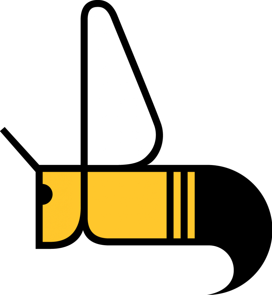
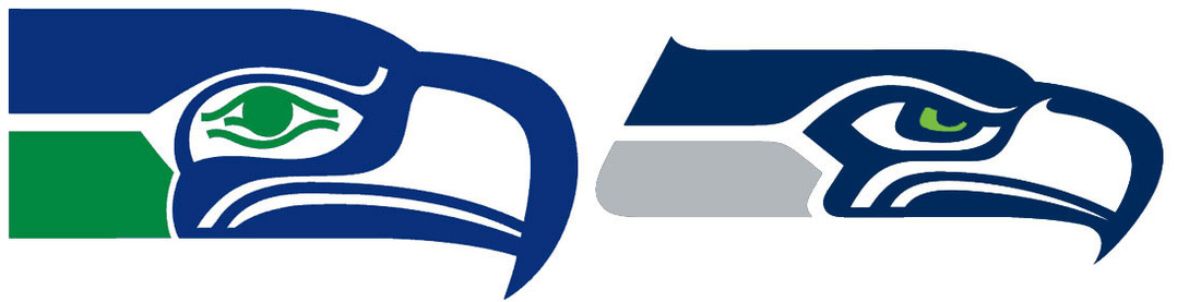
Time for a short history lesson.  For the first 26 years of their existence, the NFL's Seattle Seahawks had a really glum-looking seahawk head logo on their helmets.  Like the 1975 Hornets, the 1976 Seahawks' logo was modern for its time.  By the turn of the 21st century, however, that franchise, which didn't have much to show for those 26 years, clearly needed a better logo.  What amazed me was how simple the solution turned out to be--they gave it movement and aggression without making a lot of changes.  They made the face look mad and there's an indication of forward movement when you see the logo on the helmet.  I thought the Hornets' logo would do well with a similar approach.  I slanted the whole logo by 45 degrees to give it movement, changed the wing to make it look more like how a real hornet's wings look when it's flying, and changed the eye to make it look more aggressive.  I tweaked the antenna to make it look more like it does in the real world, too--real antennae don't stick straight up like you see in the 1975 logo.  I also made sure to make it so that you could still recreate the logo's outline with one continuous line (in order to stay true to the franchise's 1970s roots).

A closer look at the modernized Hornets logo. Click on this picture to see it full size.

3. What's up with the pants on that alternate uni?
Just hear me out: A hornet, like any other insect, has three distinct sections (a head, a thorax and an abdomen).  A football uniform also has three main parts: the helmet, the jersey and the pants.  Now, if you look at the Hornets' logo, you can imagine that the head and thorax are yellow, the abdomen is black, and where the thorax ends and the abdomen begins, you have four stripes--black, yellow, black, yellow.  I had this idea of making a uniform that matched the logo--yellow helmet, yellow jersey, and black pants with a couple of yellow stripes.  (I considered putting the stripes on the jersey, except that football players usually tuck their jerseys in--it's hockey players who don't tuck theirs in.)  And besides, I had never seen _horizontal_ stripes on pants before.  Pants have traditional vertical stripes, all sorts of swooshy (but still vertical) stripes, but not straight across.

4. Those numerals look familiar.  Did you rip those off the Boston College Eagles and/or the old Charlotte Bobcats of the NBA?
Yep--I ripped those off.  After I finished modifying the hornet logo, the hornet's head reminded me of those numerals Boston College used ten years ago--the same combination of contours and sharp points as the reworked Hornets logo itself has.  Finding the right font wasn't easy, but in the end, if you think it will help your design, it's always worth it to "go that extra mile.".

5. I see that you don't have any yellow-on-yellow or black-on-black sets.
Correct.  I hate unitards (the name I derisively give to any color-on-color football uniform).  I'm proud of my Detroit Lions, along with a few other NFL teams, for never doing that, and I'm disappointed that the Michigan Wolverines will be wearing blue-on-blue for their game against Penn State this fall.  When college teams like Oregon and Northwestern started doing that back in the '90s, it was a gimmick that I just assumed would be short-lived.  Next thing you know, NFL teams are doing it--even the Chicago Bears, one of the NFL's oldest teams, are guilty of doing it (2002, 2006).  Talk about the tail wagging the dog.

6. Let's move on to the Detroit Wheels.  Why did you pick this team?
I picked them because they were my hometown team, and also in spite of the fact that they were arguably the worst team in WFL history (more details about the crap they went through can be found here).  Above all, I did this redesign for fun.

My Detroit Wheels design. Click on this picture to see it full size.

7. Explain your Wheels design.
I wanted freeway markings, signage and lettering to dominate this design, to pay tribute to the influence the automobile has had on our society over the last century or so.  You'll see it on the striping (which is styled like two-lane highways), the font I used on the NOBs and numbers (Freeway Gothic, a font you usually only see on freeway signs) and the uniform numbers inscribed in warning signs near the top of the pants stripes.  I also wanted to change the color scheme--a few WFL teams wore black and gold (the New York Stars/Charlotte Hornets, the Wheels and the Jacksonville Express), and the Hawaiians were brown and gold.  I went with red for two reasons: It was part of the Wheels' original color scheme, and I couldn't use green because a few other WFL teams (Portland Thunder, Chicago Winds, Shreveport Steamer) were already using that color.  I replaced the black with a dark gray (for asphalt) and scaled the gold way back.  One more thing--if the Wheels existed today, then next year, I'd love to change their name to the Cruisers (in tribute to the annual Woodward Dream Cruise, in which more than 30,000 classic cars cruise up and down Woodward Avenue from Ferndale to Pontiac).

8. Where did you get that uniform template?
I don't actually have a template.  My football uniform designs are usually based on graphics I download from The Gridiron Uniform Database. I download them and modify them as I see fit.  The Hornets' home and road designs are based on the current home and road uniforms of the Green Bay Packers.  The Wheels' concept has its roots in the Kansas City Chiefs' uniform.  With all that said, I'd love to find out where Tim Brulia and Bill Schaefer (the guys who do the research for The Gridiron Uniform Database) got this template--it would be 100 times easier to use that instead of having to download one of their pictures and alter it.  Making those "TV numbers" is a pain in the neck, too.

9. What software did you use?  What you've got there looks kind of rough and primitive compared to what the "pros" churn out.
Yep, I admit it, my work looks anything but "polished".  I might be the only guy in all of the amateur uniform design community who uses Microsoft Windows Paint to do what I do.  Just about all of my other work has been created that way--use a rigid, two-dimensional uniform graphic as the base and go from there (another example is my 2012 concept for the Houston Astros, which got published on ESPN.com).  On one hand, it puts me ahead of where I'd be if I used pencils, markers and crayons.  On the other, I'd love to learn how to use PhotoShop so I can use the more three-dimensional templates out there.

Sunday, March 30, 2014

Volume 9, Number 3: An Open Letter to Dean Foods

To: Dean Foods Customer Service Dept.
From: Mark Rabinowitz
Subject: Melody Farms
Date: March 30, 2014

To whom it may concern:

What, exactly, did you do to Melody Farms?

Melody Farms was a Michigan-owned company for over 50 years before Dean Foods bought it in 2003.  I remember them from my childhood and thus considered it to be a brand I trusted for dairy products, especially milk and ice cream.

Yesterday, I came across a special at a local grocery store for Melody Farms’ “frozen dairy dessert” for $1.25 for a 1.75-quart container.  I decided that even though “frozen dairy dessert” is not the same as “ice cream,” I’ve bought products from other companies that had to be called “frozen dairy desserts” (e.g. Breyers), because, even they did not qualify as “ice cream,” I didn’t have any serious issues with them.  Furthermore, Melody Farms, as I’ve said, is a brand I remember favorably from my childhood, so I felt that I couldn’t go wrong.

I couldn’t have been more wrong.  What I had was almost tasteless with no creamy texture.  As a matter of fact, the “cookies & cream” variety had much more of a gritty texture.

I wondered just what I had bought, at which point I did something I should have done way back at the store, which was read the ingredients.

First ingredient: Not milk. WATER.

I was shocked.  Last time I checked, water was never a dairy product, and never will be.

I realize that Dean Foods owns a number of different ice cream brands here in Michigan—Dean’s, Country Fresh, Stroh’s, and Sanders as well as Melody Farms.  Having worked in market research in the past, I imagine that after acquiring Stroh’s, Sanders and Melody Farms, your marketing executives wanted to position each brand differently, and perhaps those executives decided that Melody Farms should be the brand for cheaper “frozen dairy desserts”.  Even if my suppositions are wrong, at least they make sense.

What I don’t get is what I had for dessert earlier today.  A “frozen dairy dessert” whose first ingredient is not a dairy product—that doesn’t make sense.  I would call that disappointing.

In closing, I want you to re-evaluate the recipes you are using for all Melody Farms “frozen dairy desserts”.  I would prefer that my last memory of Melody Farms be something better.  I understand that there will be a market for people who wish to save money by buying a “frozen dairy dessert” instead of a more expensive ice cream.  That does not give Dean Foods the right to serve anything that is extremely disrespectful to older Michigan consumers’ memories of—and trust in—Melody Farms products, and definitely not worthy of being called “frozen dairy desserts”.

Thank you in advance for your time and due consideration.

Sincerely,

Mark Rabinowitz

Saturday, March 8, 2014

Volume 9, Number 2: Cold Car Crazy, Revisited

A few weeks ago, my 2002 Pontiac Grand Prix was driving me up the wall. With the problems listed below, which I did not mention in my previous blog entry, I was seriously considering buying a newer car. However, it turned out these problems were easy or cheap to fix (and three of them were more my fault than the car's).

  1. The windows kept getting frosted on the inside--turns out that the problem was never the weatherstripping; it was me tracking snow and other moisture into the car; that moisture would ultimately evaporate, only to be trapped inside the car. Removing the driver's side front floor mat and bringing it into the house to dry seems to have helped.
  2. The driver's side window wasn't rolling down--that was related to the moisture problem (#2 above). The same moisture that was frosting up my windows on the inside, was also freezing the windows to the weatherstripping on the door. Using a blow dryer on the window worked, and I rubbed some de-icer on the edges of the window and on the weatherstripping in an effort to help prevent this problem from ever happening again.
  3. On Super Bowl Sunday, I had trouble removing a burned-out bulb from one of my tail lights because--get this--tons of moisture had gotten into the tail light and turned to ice, so I had to resort to using a blow dryer to melt enough ice to get the bulb out. The cause is that the seal on that tail light had been compromised (it's a common problem with this car, from what I've read).
  4. The washer fluid wasn't coming out when I needed it--that problem was also my fault. I had some cheap Slug-A-Bug washer fluid that froze up in 32° Fahrenheit or lower. Siphoning out that fluid (something that I could not do until temperatures got above 32°) and replacing it with a better fluid (the kind that works down to -30° F) seems to have done the trick.
  5. On top of all that, my car was having trouble starting, but that was due to a battery that was four years old and was no longer holding a charge; replacing that was inexpensive and effective (not to mention a no-brainer).

Now that I've conquered these issues, I am no longer debating buying another car. On the contrary, I've re-dedicated myself to keeping my Grand Prix going as long as possible. I've already lined up a few repair projects that I'll tackle when the weather gets warmer:

  1. The fuel filler door is being a real pain in the neck to open and close (this is another common problem with the 1997-2003 Grand Prix; I'd like to either fix the hinge on it, which is faulty, maybe because the hinge pins are rusted, or replace the door if it comes down to that)
  2. The driver's side molding rail needs to be replaced (that's a piece of metal that supports the plastic molding that goes over the rocker panel; without it, the molding sags like a clothesline, and that's just what happens when the rail turns to rust).  I've already had experience with this repair because I replaced the same rail on the passenger side four years ago.
  3. I'm going to see if I can use some silicone adhesive to restore the seal on the right tail light so water doesn't get into it again.  The way I see it, I've got nothing to lose in trying this--if it works, it'll save me from having to buy a replacement tail light on eBay or from a junkyard, and if it doesn't, at least I'll still have eBay and junkyards to fall back on.

Monday, February 10, 2014

Volume 9, Number 1: Cold Car Crazy

I'm having a bit of a debate with myself right now. I wonder if it is a good idea to buy a newer car when I hardly drive my current car at all (I work out of my home 80% of the time these days, so I only drive about 5,000 miles a year)--it's not quite as extreme as buying a luxury car or a sports car just for trips to the supermarket, but it's as close as it gets to that extreme. At the same time, however, I am not sure if it is a good idea to spend good money to fix all of the problems I'm contending with in my current car (the same 2002 Pontiac Grand Prix I bought in 2008), only to be met with other problems down the road. The main problem right now is that the weatherstripping is apparently not able to keep out moisture, so I occasionally have windows frosting up on the inside (and the windows aren't rolling down, either--moisture must have gotten between the windows and the seals, causing them to stick together).

I'm always looking for new ways to save money. I know I already mentioned this on my Facebook timeline, but I have a portable jump-starter that I've had for 12 years (it's a Car Start 1000, similar to the one shown here). However, when jump-start a dead battery with it last month, it didn't work because it wasn't holding a charge. I figured it was time to start looking for a new portable jump-starter. But then I realized... before I buy a new one, I've got nothing to lose by taking the old one apart to see if it's got an internal battery that I can replace myself. And lo and behold, I found out that it did (see the picture below--that dark gray block that the booster cables are bolted to is a 12-volt sealed lead acid battery).


I managed to find a replacement battery (on eBay, your friend and mine). Last Wednesday, I successfully put in the new battery, giving my 12-year-old Car Start 1000 a few more years of useful life. I ended up spending $29 on that battery (by comparison, a brand new Car Start 1000 goes for $60 on Amazon.com). But I should let you know, replacing the battery in a portable jump-starter is not easy. In addition to the usual hazards associated with sealed lead acid batteries, putting the Car Start 1000 back together was not as easy as taking it apart was. In retrospect, maybe I should have looked into this project a few years ago... that kind of battery usually doesn't last much longer than a few years, let alone 12.