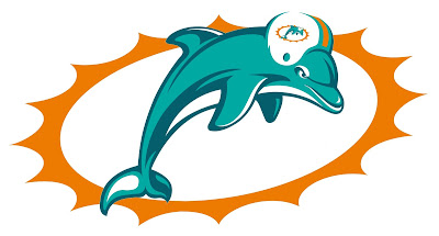
My entry did, and to the best of my knowledge, I was the only one who did put a dolphin on the helmet that the leaping dolphin is wearing (instead of the "M" that you've seen on the Dolphins' logo since their inception in 1966).
The good news is that, once Paul realized that he had goofed, he promised that he would "set the record straight", and today, he kept that promise. I would have been happy with one paragraph with links to my graphics, but in my opinion, Paul exceeded my expectations. He also showed readers the entry I had submitted, and on top of that, he even quoted one of my e-mails on the subject, both of which went beyond what I had expected.
One more footnote about my contest entry: Daniel Gold, who also submitted an entry to the Dolphins contest (and whose modernized take on the Cleveland Browns' elf logo earned him an honorable mention in the Redesign the Browns contest results), noted that I made a blooper myself. He said that by stretching and skewing the sunburst, I had changed it into an impossible form, since the sun is, and always will be, a sphere. In short, what I had done with that sunburst was no better than the one in the leaked Dolphins' logo from last December, the one that implied that a sunburst could be underwater.
So, on his advice, I went about making a modified version of my logo, one with the sunburst restored to its usual round form. And son of a gun, it works. For the sake of comparison, in the image below, I have the logo from my submission on the left, and the modified version on the right. The graphic below that shows what the unis would look like with the modified logo.
My only issue with the modified logo is that it looks even more unoriginal and derivative than it already did, as I can now say there are only three differences between that and the logo the Dolphins used from 1997 to 2012:
- The colors in the logo (changed the aqua and orange to the hues of aqua and orange the Dolphins used in the 1970s; replaced the navy blue parts in the logo with the deeper, bluer aqua the Dolphins used in 1997-2012)
- I rotated the leaping dolphin by 15 degrees
- The aforementioned "infinite regression"
That's OK with me, though. I've always liked the 1997-2012 logo, especially with the facial expression on the dolphin. The 1997-2012 logo and unis are fine as they are, really; I just can't stand the orange jerseys, and I also hate when the Dolphins wear aqua pants with aqua jerseys. But above all, I can't stand the leaked logo from December, which another Uni-Watch blog reader said looks like something Sea World would have commissioned.


